- Joined
- Jun 19, 2019
- Posts
- 7,343
- Reaction score
- 3,954
- Points
- 28,820
- Location
- taotao's career fan
- Plus Coins
- ⨭4,927,260
this slayage 
AKID❀KI
Death's Mistress- Joined
- Jun 10, 2019
- Posts
- 2,516
- Reaction score
- 6,069
- Points
- 33,520
- Location
- Cracked & Devoured
- Plus Coins
- ⨭5,921,164
Yay @Baymax We did it! 
Thanks for being an awesome partner. I couldn't have done it without you.
Thank you judges for all the remarks! We will take what you said into consideration next time we make gfx.
And thanks llama for hosting!
P.s. all the gfx looks awesome. I love them all. Everyone are so talented.
Thanks for being an awesome partner. I couldn't have done it without you.
Thank you judges for all the remarks! We will take what you said into consideration next time we make gfx.
And thanks llama for hosting!
P.s. all the gfx looks awesome. I love them all. Everyone are so talented.
- Joined
- Jun 15, 2019
- Posts
- 7,295
- Reaction score
- 63,471
- Points
- 82,420
- Location
- summer with techi
- Plus Coins
- ⨭1,195,600
Wow everyone is so talented. I’m jealous
- Joined
- Jun 15, 2019
- Posts
- 1,337
- Reaction score
- 1,153
- Points
- 12,820
- Location
- Yurina's protection squad
- Plus Coins
- ⨭2,137,509
This is the first time i really looked in the thread haha
Wow everyone is so talented. I’m jealous

- Joined
- Jun 15, 2019
- Posts
- 1,337
- Reaction score
- 1,153
- Points
- 12,820
- Location
- Yurina's protection squad
- Plus Coins
- ⨭2,137,509
Im late but Aki & Bay team ...  its actually made me scared by looking at it
edit: this noob need tutorial
its actually made me scared by looking at itedit: this noob need tutorial
Baymax
(•—•)Sorry it took me so long to drop a comment, but I wanted to say how much I loved everyone’s submissions and ideas/concepts! I also loved how there was a mix of film posters and book covers. Everyone did so well, Corner Candy Shop really snappedt!
Thank you to the judges and their comments, I’ll take them in consideration for mine and Aki’s submission as well as everyone else’s since there are some helpful tips in all the comments!
I was viewing our poster from different devices and I didn't realise how dark it was in some areas
it looks quite light on my laptop screen, so I'll have to mess around a bit with the brightness and colours in the future!
and I couldn't have done it without you!
AKID❀KI
Death's Mistress- Joined
- Jun 10, 2019
- Posts
- 2,516
- Reaction score
- 6,069
- Points
- 33,520
- Location
- Cracked & Devoured
- Plus Coins
- ⨭5,921,164
Thanks so much! it actually was not as hard as i thought it would be.Im late but Aki & Bay team ...
edit: this noob need tutorial
For the split head we used this.
I use gimp so here is the tutorial for gimp. But the tutorial for photoshop is available too. I just replaced the flowers with spiders. I took a spider image. edited and made the background transparent.
For the face i followed the tutorial below. and then decided to desaturate the pic and the half head layer. I used the circle and selected the girls eye. made a new layer and added red inside the selection. before changing the layer from normal to multiply (something they use for duotone pics). that changed the eye shade red. I didnt merge it yet. i cleaned up the edges and once i was satisfied merged it. i went to the layer of the girl's half head and erased the eye to make it look empty.
In the tutorial where the flower layer is. I inserted my spiders. I copy pasted a couple and then adjusted their rotation and shear tool i think. to get it to look a lil more legit. Then i once again used the duotone technique add a layer over the spider layer, put red as the colour of the layer and then played around with multiply and colour curves to get the colour i wanted for the spiders.
Last edited:
moue
⥀⥀⥀Thanks so much! it actually was not as hard as i thought it would be.
For the split head we used this.
I use gimp so here is the tutorial for gimp. But the tutorial for photoshop is available too. I just replaced the flowers with spiders. I took a spider image. edited and made the background transparent.
For the face i followed the tutorial below. and then decided to desaturate the pic and the half head layer. I used the circle and selected the girls eye. made a new layer and added red inside the selection. before changing the layer from normal to multiply (something they use for duotone pics). that changed the eye shade red. I didnt merge it yet. i cleaned up the edges and once i was satisfied merged it. i went to the layer of the girl's half head and erased the eye to make it look empty.
In the tutorial where the flower layer is. I inserted my spiders. I copy pasted a couple and then adjusted their rotation and shear tool i think. to get it to look a lil more legit. Then i once again used the duotone technique add a layer over the spider layer, put red as the colour of the layer and then played around with multiply and colour curves to get the colour i wanted for the spiders.
Thank you Aki!
I was gonna post this point for everyone, btw!
- Black & White
A good example, is Japanese waves:

The waves manage to be a good level of contrast, while still perfectly conveying the concept of waves enveloping themselves.
For this very reason, I very rarely use black or white in my pieces. I will generally go for a brown/dark gray and cream/alabaster color.
This is especially important in the case of nature, as well as cute images. You might notice that Molang’s border color isn’t actually black. It hasn’t been for some years now.
This allows Molang to be soft, but perfectly balanced in terms of contrast. He doesn’t have many features, so it is important for them to be noticeable. Another prime example is Budding Pop.
Both of these characters have similar proportions to Hello Kitty.
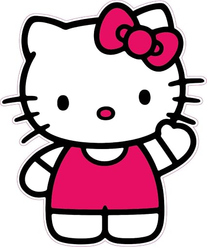
But Hello Kitty looks very compact, and rigid compared to Molang and Budding Pop. While her hand is in the air, it doesn’t really convey it being waved. This isn't exactly a bad thing, as for some people being smaller is cuter. By making her look more compact, she is then cuter.
This is also related to line weight, as Hello Kitty’s border is quite a bit thicker.
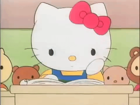
The thing is, both styles have their place. Comic books and tattoos often have other means to create movement (for comic books, it is chiefly line weight,) so it doesn’t, generally, bother the eyes. As a matter of fact, from the show, her boder is much thinner,
This can be an issue with photos, as well! You’ll notice, when you increase the contrast on an image it often makes the black lines look thicker if you go too far, this makes the image a lot less attractive. Be sure to always compare your contrasted photo with the original to ensure it is an improvement.
Bobo
.- Joined
- Jun 16, 2019
- Posts
- 6,296
- Reaction score
- 17,767
- Points
- 80,870
- Location
- @taeyang_0228
- Plus Coins
- ⨭1,100
I kinda want to read Krystal's coven story now 
BlessMeAchoo
Excuse My CharismaHello everyone!~
Lately I've been trying to improve my photoshop skills, so I thought I may as well join
How do I join?
Lately I've been trying to improve my photoshop skills, so I thought I may as well join
How do I join?
moue
⥀⥀⥀Just make a member card and join our discord server!Hello everyone!~
Lately I've been trying to improve my photoshop skills, so I thought I may as well join
How do I join?
Discord - A New Way to Chat with Friends & Communities
Discord is the easiest way to communicate over voice, video, and text. Chat, hang out, and stay close with your friends and communities.
 discord.gg
BlessMeAchoo
Excuse My CharismaOk, will do! Thanks~Just make a member card and join our discord server!
Discord - A New Way to Chat with Friends & Communities
Discord is the easiest way to communicate over voice, video, and text. Chat, hang out, and stay close with your friends and communities.
moue
⥀⥀⥀Topic 4: Album Covers

For this topic, your task is to create an album cover for a group or artist of your choice. You can go as far with the concept as you like. Be sure to include details such as the title, group name, rating etc.
Last edited:
- Joined
- Jun 20, 2019
- Posts
- 842
- Reaction score
- 701
- Points
- 14,120
- Location
- Who knows?
- Plus Coins
- ⨭236,362
Some websites you guys should visit if you guys looking for inspirations/materials:
1. FREEPIK.COM: BEST WEBSITE IN THE WORLD. Here you can have a wide variety of PSD/Vectors/Background... and most of them are free
2. brusheezy.com/vecteezy.com: Brush and vectors for free. But TBH i don't visit vecteezy that much since most of the time it doesn't have what i like
3. myfonts.com/WhatTheFont: Post a pic there, then it will try to identify the font that is used in that pics. But since most MyFonts font is not FREE, what i like to do after knowing the font that is used is searching the font name online to see if there's any free options that are similar to the fonts i like
4. wix.com/website/templates: Yes, i visit WIX templates from time to time to look for inspirations when i make OP
moue
⥀⥀⥀Topic 4: Album Covers
960717: me | wonwoo
For my first submission ever I decided to make this so I can finally will a Wonwoo solo into existence lmao. I included both a front cover and a back cover just cause I thought it'll look nicer that way. The front cover has the title of the single album and a pic of a purple mic, which is pretty much synonymous with Wonwoo at this point (although I heard he might change it soon, rip). The back cover is just the tracklist and his signature.
FRESH by DBCS (Moonlight Angels; 달빛천사) - The First Mini Album | yerimmie
Linked above is the album preview. Other links I'll put here: Digital cover: https://i.ibb.co/3yyyrXn/digital-cover.png Photocards: https://i.ibb.co/x1Nc84P/photocards.png Screenshot showing that the single is topping the Melon chart!!!: https://i.ibb.co/vLqqLX6/Screen-Shot-2019-11-04-at-23-03-33.png (please include the stuff below in the post!!!) ‘Fresh’ is DBCS’s debut mini album. The single “Fresh!” is an upbeat funk genre with various elements of electro jazz. Among 6 songs in total, track number 6 “Orange” shows their musical talent through the members’ composing skills, as all members contributed to the production of the bonus track for the fans. The album includes 1 photo card (random 1 out of 6), 1 group poster (only available for pre-orders), 1 group post card, 1 recipe card (random 1 of 5), 1 balloon, and 1 packet of orange seeds.
<TRACK LIST> 01. Fresh! *Title*
02. 새벽 (Dawn)
03. 잊지 말아주세요 (Please Don’t Forget Me)
04. Jealous
05. Love Again
06. Orange *Bonus*
[ALBUM DETAILS] yyxy repackage beast and the beat | Joo
Orbits have been waiting for yyxy repackage album but it never got released Loona as a whole debuted before yyxy got their repackage so I decided to make a yyxy repackage of my own ! Based on one of their photoshoots they did as their unit,I chose the title as beast and the beat to compliment how each Loona repackage title is a tweaked version of the album before it the font is colored in black and black is Olivia hye’s color.
As for the concept I decided to go with the Photoshoot feels and having it as cutesy and UWU as passible and choosing a calm hue of the color blue.
for the song list I decided to have ONE song for shock value and it’s Loona they can do whatever they want and we’ll still buy this lol
the title song is called Da capo as to be the equivalent to dal segno being a musical sign but it can also mean this
in the Loonaverse lore
Dal segno:
(especially as a direction) in a way that repeats from the point marked by a sign.
and Da capo
(especially as a direction) repeat from the beginning.
Which can mean that the loop has restarted in the Loonaverse which it did by the end of hi high and butterfly but why one song ? Are they gonna add more with time is it gonna be “delayed but someday” ? Hm ? Oh ? Are you interested ?
Well then..
STAN LOONA !!
My I | Baymax
For this topic, your task is to create an album cover for a group or artist of your choice. You can go as far with the concept as you like. Be sure to include details such as the title, group name, rating etc.960717: me | wonwoo

For my first submission ever I decided to make this so I can finally will a Wonwoo solo into existence lmao. I included both a front cover and a back cover just cause I thought it'll look nicer that way. The front cover has the title of the single album and a pic of a purple mic, which is pretty much synonymous with Wonwoo at this point (although I heard he might change it soon, rip). The back cover is just the tracklist and his signature.
FRESH by DBCS (Moonlight Angels; 달빛천사) - The First Mini Album | yerimmie

Linked above is the album preview. Other links I'll put here: Digital cover: https://i.ibb.co/3yyyrXn/digital-cover.png Photocards: https://i.ibb.co/x1Nc84P/photocards.png Screenshot showing that the single is topping the Melon chart!!!: https://i.ibb.co/vLqqLX6/Screen-Shot-2019-11-04-at-23-03-33.png (please include the stuff below in the post!!!) ‘Fresh’ is DBCS’s debut mini album. The single “Fresh!” is an upbeat funk genre with various elements of electro jazz. Among 6 songs in total, track number 6 “Orange” shows their musical talent through the members’ composing skills, as all members contributed to the production of the bonus track for the fans. The album includes 1 photo card (random 1 out of 6), 1 group poster (only available for pre-orders), 1 group post card, 1 recipe card (random 1 of 5), 1 balloon, and 1 packet of orange seeds.
<TRACK LIST> 01. Fresh! *Title*
02. 새벽 (Dawn)
03. 잊지 말아주세요 (Please Don’t Forget Me)
04. Jealous
05. Love Again
06. Orange *Bonus*
[ALBUM DETAILS] yyxy repackage beast and the beat | Joo


Orbits have been waiting for yyxy repackage album but it never got released Loona as a whole debuted before yyxy got their repackage so I decided to make a yyxy repackage of my own ! Based on one of their photoshoots they did as their unit,I chose the title as beast and the beat to compliment how each Loona repackage title is a tweaked version of the album before it the font is colored in black and black is Olivia hye’s color.
As for the concept I decided to go with the Photoshoot feels and having it as cutesy and UWU as passible and choosing a calm hue of the color blue.
for the song list I decided to have ONE song for shock value and it’s Loona they can do whatever they want and we’ll still buy this lol
the title song is called Da capo as to be the equivalent to dal segno being a musical sign but it can also mean this
in the Loonaverse lore
Dal segno:
(especially as a direction) in a way that repeats from the point marked by a sign.
and Da capo
(especially as a direction) repeat from the beginning.
Which can mean that the loop has restarted in the Loonaverse which it did by the end of hi high and butterfly but why one song ? Are they gonna add more with time is it gonna be “delayed but someday” ? Hm ? Oh ? Are you interested ?
Well then..
STAN LOONA !!
My I | Baymax

No explanation for this except... stan Seventeen, stan Chinaline!
New You | Seriously
I'd recently been playing with new techniques like double exposure etc, and had a Solar edit I wanted to continue working with, this seemed like a perfect opportunity. I chose a green palette to mix things up, as most of the stuff I do is in shades of purple or blue. Oh and I used her full birth name because it just looked classy kek.
Dreams of a sinner | Lavender
I was thinking If I ever made a album what would it be like what is the mood. What's the vibe. And I came to the conclusion I would would be trendy edgy pop with a soft touch. I truly dont know tbh.
Hani - Summer Breeze - The 1st Mini Album | Frandae
I picked Hani from the girl group EXID as the main protagonist because I think she isn't known or recognized for her vocals that much when, in fact, she can sing really well and do a lot of different genres/music styles. The name of the album is "Summer Breeze" and the feelings/vibes that generates; whether they are positive or not so positive. That's reflected in the songs themselves; "Summer Breeze" is the title track; it talks about something fresh but calm that gives you a comfortable feeling and becomes a good memory when time passes. And then you can find 5 b-sides related to that summerish vibe. "One Day" and "Last Night" are different moments, experiences and sensations that you can have and live through those different times of a day: daytime and nighttime. "Memories" is self-explanatory; the lyrics contain beautiful and meaningful memories that the singer wants to always remember and keep in her thoughts. Last but not least, we have "Milk" and "Hello", which are previous solos she had in some EXID albums. "Milk" talks about missing someone and trying to fill that emptiness (with the word/sound play "you" and "uyu" (우유) that means milk in korean) and "Hello" talks about that mix of feelings that you have when you don't want to care about someone but at the end you still do no matter what. GFX related explanation would be that I tried to emphasize the Summer Breeze feeling/vibe using water backgrounds, different shades of blue/turquoise and white. To add an extra detail to the CD itself, I put her signature; because I feel like she would personally sign the CDs so that her fans could have a beautiful memory from it; like everytime they see the signature, fans can remember good times/memories of them stanning Hani and EXID. So yeah that's it! Sorry for the long explanation lmao; hope you all like it!
Warped Dreams | Akidoki
Version 2
From the beginning i wanted the cover to look like a dream. I wanted it to have this twisted,surreal look. While still having this sense of innocence and fragility. I wanted the daydream one to look softer than the nightmare one but not be too different. Based off the image and the twisted dreamy vibe it has i went with the title Warped dreams and then the names for the two versions.
le chat noir - EXID | softest_bun
A concept for EXID that seemed to suit the group.
New You | Seriously

I'd recently been playing with new techniques like double exposure etc, and had a Solar edit I wanted to continue working with, this seemed like a perfect opportunity. I chose a green palette to mix things up, as most of the stuff I do is in shades of purple or blue. Oh and I used her full birth name because it just looked classy kek.
Dreams of a sinner | Lavender

I was thinking If I ever made a album what would it be like what is the mood. What's the vibe. And I came to the conclusion I would would be trendy edgy pop with a soft touch. I truly dont know tbh.
Hani - Summer Breeze - The 1st Mini Album | Frandae

I picked Hani from the girl group EXID as the main protagonist because I think she isn't known or recognized for her vocals that much when, in fact, she can sing really well and do a lot of different genres/music styles. The name of the album is "Summer Breeze" and the feelings/vibes that generates; whether they are positive or not so positive. That's reflected in the songs themselves; "Summer Breeze" is the title track; it talks about something fresh but calm that gives you a comfortable feeling and becomes a good memory when time passes. And then you can find 5 b-sides related to that summerish vibe. "One Day" and "Last Night" are different moments, experiences and sensations that you can have and live through those different times of a day: daytime and nighttime. "Memories" is self-explanatory; the lyrics contain beautiful and meaningful memories that the singer wants to always remember and keep in her thoughts. Last but not least, we have "Milk" and "Hello", which are previous solos she had in some EXID albums. "Milk" talks about missing someone and trying to fill that emptiness (with the word/sound play "you" and "uyu" (우유) that means milk in korean) and "Hello" talks about that mix of feelings that you have when you don't want to care about someone but at the end you still do no matter what. GFX related explanation would be that I tried to emphasize the Summer Breeze feeling/vibe using water backgrounds, different shades of blue/turquoise and white. To add an extra detail to the CD itself, I put her signature; because I feel like she would personally sign the CDs so that her fans could have a beautiful memory from it; like everytime they see the signature, fans can remember good times/memories of them stanning Hani and EXID. So yeah that's it! Sorry for the long explanation lmao; hope you all like it!
Warped Dreams | Akidoki

Version 2

From the beginning i wanted the cover to look like a dream. I wanted it to have this twisted,surreal look. While still having this sense of innocence and fragility. I wanted the daydream one to look softer than the nightmare one but not be too different. Based off the image and the twisted dreamy vibe it has i went with the title Warped dreams and then the names for the two versions.
le chat noir - EXID | softest_bun


A concept for EXID that seemed to suit the group.
moue
⥀⥀⥀Topic 5: Concept Showdown
Voting will be done by H+ users

For this topic, CCS will be split into two groups. Each group will have the task of creating an entire concept for a K-pop group of their choice. The group can be existing, or be entirely fictional.
Required Elements:
- Logo (Reinvent the logo if the group exists)
- Album Cover
- 2 pieces of merch (such as towels, or water bottles)
- Light Stick
- Mock OP
Submit here by December 4th
Teams will be announced in discord.
Group members are not allowed to let anyone outside of CCS know which members are on either team.
No mass PMs, and no recruiting for votes.
Teams will be announced in discord.
Group members are not allowed to let anyone outside of CCS know which members are on either team.
No mass PMs, and no recruiting for votes.
Last edited:
AKID❀KI
Death's Mistress- Joined
- Jun 10, 2019
- Posts
- 2,516
- Reaction score
- 6,069
- Points
- 33,520
- Location
- Cracked & Devoured
- Plus Coins
- ⨭5,921,164
All the entries are so gorgeous and stunning.
The different techniques and the concepts! I love them all so much!
The different techniques and the concepts! I love them all so much!
Baymax
(•—•)Everyone snapped so hard on their album cover; I love them all and I love how some of you guys did more than what was expected 
- Joined
- Jun 15, 2019
- Posts
- 14,852
- Reaction score
- 27,545
- Points
- 72,670
- Location
- Under Handong's hat
- Plus Coins
- ⨭30,300
Everybody did super well, but Joo smashed this one, awesome!
moue
⥀⥀⥀I was checking my insta feed, and remembered this:
This girl is beautiful right? She is actually a hyperrealistic 3D model.
Her realism is so baffling, she actually often poses with real models.
She is so realistic, her fame has sparked a debate over digital models replacing real ones. She has even been featured on the pages of major brands, such as Fenty beauty.
Cameron James Wilson comments on her creation, as well as how she went viral.
-
This site uses cookies to help personalise content, tailor your experience and to keep you logged in if you register.
By continuing to use this site, you are consenting to our use of cookies.