kyom ✦ kyom ✦ pom
•┈••✦ 🔫- Joined
- Jul 16, 2020
- Posts
- 3,421
- Reaction score
- 8,883
- Points
- 33,420
- Plus Coins
- ⨭276,350
- Pronouns
- She/Her


Context! I used to make really tacky, big sets that had cute little borders. My favorite was a Jane set from Banana Chacha (I was a big fan of Momoland)


It was for a Pokemon non-event on OH.
So, to the absolute abyss that is H+ studio, I shall muse about the process.

So, yesterday. Jiwoong posted a [

Since seeing the clips of him dropping everything on the table, I knew I would be picking the cream licking frames. The next question was the frame!
So I had a few thoughts but settled on the frosting around a circular frame. I remember practicing piping a few years ago and we did straight lines. Back during Valentine's I made a cake for the letters but felt like the assets could be improved upon so I made fresh cream and fruits in Blender.


So, the strawberry was harder than I thought? Not the shape as much as the pinches for the seeds. In the first version I filled the fruit with seeds but decided suggestion was more than enough. I still didn't get the texture of the strawberry just right, but I think I got a nice sheen on it. It just seems a bit too... velvety? I have an idea on how I could fix it, but this was for fun, so I am not too picky about it.
The cherry was easier, but I kind of sent myself in a circle with the stem, since I was set on making it green but realized a red stem made more sense.

The last was watermelon! Apparently it is Jiwoong's favorite. I could not get it at all. I just couldn't get the sheen to matte balance right.

It looks like meat or papaya to me? The more red I made it, the more it looked like meat. The more pink I made it, the more it looked like papaya. I did a few seeds but it just didn't look good enough to me. It came out matte enough at the top angle, though. I guess I was fine with it because I thought it was papaya when he was putting the watermelon on the cake, anyway. Maybe I should have gone more pink?
So, next step was to output the frames:

So you might notice that the square frame is a bit darker than the circle frames. It is because the light I had illuminating the creams was round, so it didn't touch all of the edges of the square frame. I actually think it looks nicer with the dark corners.
I think took the clips I liked, masked them into the right shape and gave them some coloring. I wanted to go for an old tumblr color leveling. I wanted to bring out the red, but the background might have pushed too much forward.
In the end I combined it all and exported!

How do you like it?
- Joined
- Jun 16, 2019
- Posts
- 115,762
- Reaction score
- 64,096
- Points
- 119,420
- Location
- With fromis_9
- Plus Coins
- ⨭826,650
Pretty set!
kyom ✦ kyom ✦ pom
•┈••✦ 🔫- Joined
- Jul 16, 2020
- Posts
- 3,421
- Reaction score
- 8,883
- Points
- 33,420
- Plus Coins
- ⨭276,350
- Pronouns
- She/Her
- Joined
- Jun 16, 2019
- Posts
- 115,762
- Reaction score
- 64,096
- Points
- 119,420
- Location
- With fromis_9
- Plus Coins
- ⨭826,650
Everything you make is pretty to me! No lies, only truth!Thank you!

kyom ✦ kyom ✦ pom
•┈••✦ 🔫- Joined
- Jul 16, 2020
- Posts
- 3,421
- Reaction score
- 8,883
- Points
- 33,420
- Plus Coins
- ⨭276,350
- Pronouns
- She/Her
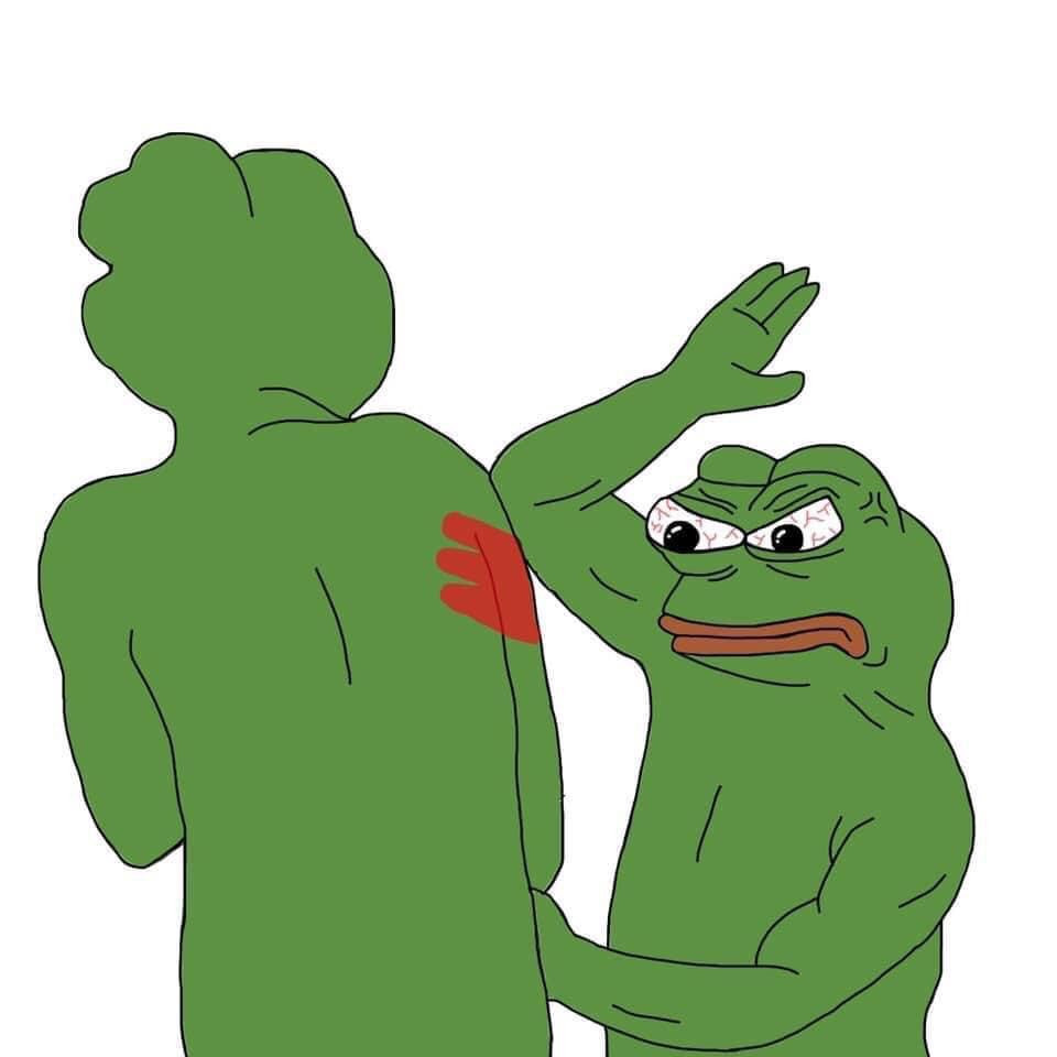
STOP BEING SO SWEETEverything you make is pretty to me! No lies, only truth!
- Joined
- Jun 16, 2019
- Posts
- 115,762
- Reaction score
- 64,096
- Points
- 119,420
- Location
- With fromis_9
- Plus Coins
- ⨭826,650
- Joined
- Jun 15, 2019
- Posts
- 18,986
- Reaction score
- 31,972
- Points
- 77,670
- Location
- Horny Jail
- Plus Coins
- ⨭309,450
- Pronouns
- He/Him
This bish really 3d modelled incredibly detailed fruit, for a damn frame... her talent... it sickens me...


kyom ✦ kyom ✦ pom
•┈••✦ 🔫- Joined
- Jul 16, 2020
- Posts
- 3,421
- Reaction score
- 8,883
- Points
- 33,420
- Plus Coins
- ⨭276,350
- Pronouns
- She/Her
YOU KNOW THE RULES!This bish really 3d modelled incredibly detailed fruit, for a damn frame... her talent... it sickens me...


(Also, thank you <3)
Suspiciously sensual????? Is that what we call it these days??

It's soooo cute llama, you slayed again

It's soooo cute llama, you slayed again

kyom ✦ kyom ✦ pom
•┈••✦ 🔫- Joined
- Jul 16, 2020
- Posts
- 3,421
- Reaction score
- 8,883
- Points
- 33,420
- Plus Coins
- ⨭276,350
- Pronouns
- She/Her
Thank you Chu!!!Suspiciously sensual????? Is that what we call it these days??
It's soooo cute llama, you slayed again

Sweetheart
Cake boss- Joined
- Jun 16, 2019
- Posts
- 7,051
- Reaction score
- 19,550
- Points
- 92,870
- Location
- Bara Bakery
- Plus Coins
- ⨭94,750
I like it  i wanna eat jiwoong cake

 i wanna eat jiwoong cake

kyom ✦ kyom ✦ pom
•┈••✦ 🔫- Joined
- Jul 16, 2020
- Posts
- 3,421
- Reaction score
- 8,883
- Points
- 33,420
- Plus Coins
- ⨭276,350
- Pronouns
- She/Her
Thank you! And yours is free with a complimentary latteI like iti wanna eat jiwoong cake


- Joined
- Jun 24, 2019
- Posts
- 6,892
- Reaction score
- 10,347
- Points
- 59,420
- Plus Coins
- ⨭175,900
- Pronouns
- She/Her
is this really tacky? i don't think so! i love it!  seeing some of your process and thoughts on it was cool too, thank you for sharing
 seeing some of your process and thoughts on it was cool too, thank you for sharing
kyom ✦ kyom ✦ pom
•┈••✦ 🔫- Joined
- Jul 16, 2020
- Posts
- 3,421
- Reaction score
- 8,883
- Points
- 33,420
- Plus Coins
- ⨭276,350
- Pronouns
- She/Her
is this really tacky? i don't think so! i love it!seeing some of your process and thoughts on it was cool too, thank you for sharing

How many times do I have to repeat the rules?

But really, thank you
And I'm glad you enjoyed it! The process is usually a whirlwind of "i wonder if that's possible?" Lmao
- Joined
- Jun 16, 2019
- Posts
- 115,762
- Reaction score
- 64,096
- Points
- 119,420
- Location
- With fromis_9
- Plus Coins
- ⨭826,650
How many times do I have to repeat the rules?
I think that this will be the #1 most break rule on H+

-
This site uses cookies to help personalise content, tailor your experience and to keep you logged in if you register.
By continuing to use this site, you are consenting to our use of cookies.

